Gubb and Mackie
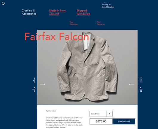
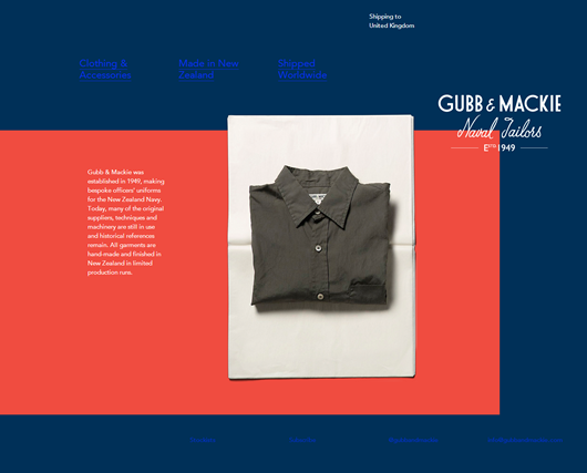
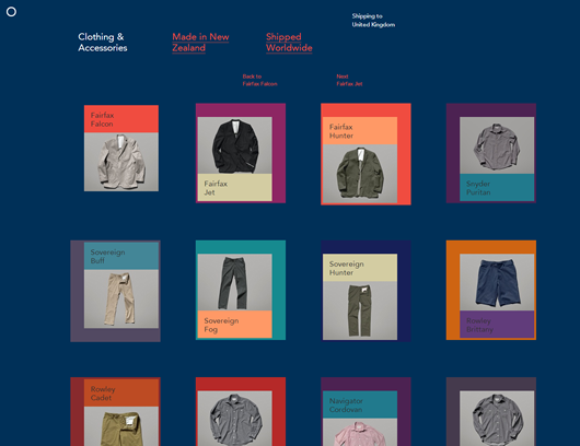
A distinctive use of colour, and typography. Using blue links that clash with the navy background, ditching usability in place of style somehow works well, there ballsy approach to grid structure is also nice to see.
The site was designed by Sons & Co. and you can view it here — Gubb and Mackie